From a UX perspective, Magic Links (ML) create a “Unified Entry” experience. There is no traditional “Sign Up” vs. “Sign In” toggle; there is only “Enter your email.”
However, while the entrance is the same, the redirect logic behind the scenes must be different to ensure a smooth user journey.
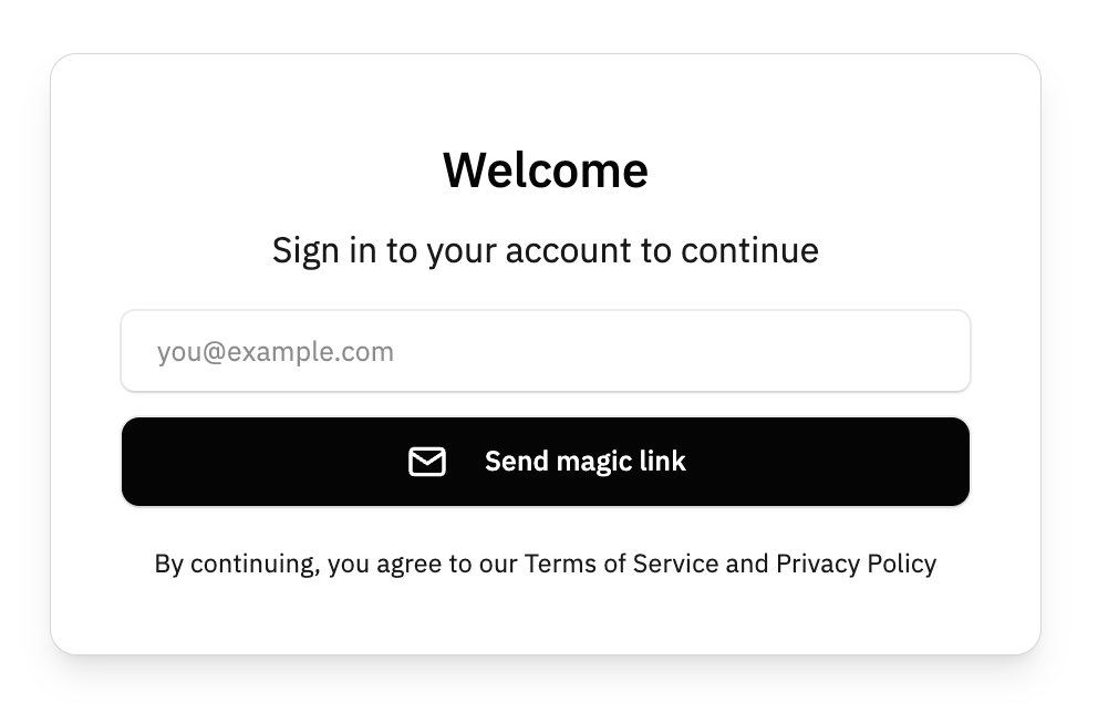
1. The “Unified Entry” UX Logic
In the application, the login form only needs one input field and one button. Super simple.
- User Action: Enters
email@example.comand clicks “Send Link.” - System Action: Supabase checks if the email exists.
- If Yes: It sends a “Sign In” link.
- If No: It creates a new user record and sends a “Sign Up” link.
- Result: The user never has to remember if they already have an account. This removes the “User already exists” or “Incorrect password” friction.
2. The Development Challenge: Post-Login Branching
Since there is no boundary at the gate, we must create a boundary after they click the link in their email. We need to know if they are a returning user (go to Dashboard) or a new user (go to Onboarding).
4. UX Pros & Cons for the Marketplace
| Pro | Con |
| Highest Conversion: No passwords to forget. | Context Switching: Users have to leave your site to open their email app. |
| Security: No credential stuffing or weak password issues. | Link Expiration: If the user waits too long, the link dies (default is usually 1 hour). |
| Clean UI: One input, one button. | Mobile Friction: Switching between a browser and a mail app can sometimes lose the session “state” on older phones. |