We all know and love buttons – they are the workhorses of any user interface. But creating consistent and scalable buttons across your designs can sometimes feel like a repetitive chore. That’s where Figma components come to the rescue, and understanding how to build robust button components is a key skill for any UI designer.
Recently, I was diving deep into button component best practices, and I stumbled upon a fantastic visual guide (which I’m sharing below!). It perfectly breaks down the anatomy of a button component and highlights the key properties you should consider. Let’s explore what we can learn from this Figma screenshot and how you can apply these principles to your own design workflow.
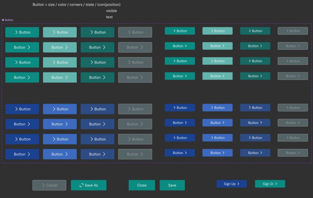
Here’s the inspiring screenshot:
Deconstructing the Button Blueprint
Looking at this Figma study, it’s clear that a well-structured button component is more than just a shape and some text. It’s a system of customizable elements. The top of the image clearly lays out the core properties:
- Button > size / color / corners / state / icon (position)
- This is the master list! It tells us the essential aspects we need to make our button truly flexible. Let’s break each one down:
- Size: Buttons need to come in different sizes to suit various contexts. Think about primary action buttons versus smaller, less prominent options.
- Color: Brand colors, semantic colors (primary, secondary, accent, etc.), and state-related colors (hover, active, disabled) all come into play.
- Corners: Rounded corners, sharp corners, or varying degrees of roundness – corner radius dramatically impacts the visual style of your buttons.
- State: Buttons aren’t static! They have different states like default, hover, pressed, focused, and disabled. Each state needs visual feedback to guide the user.
- Icon (position): Sometimes you need icons to enhance button clarity or save space. The position of the icon (left, right) is also a configurable property.
- visible
- Simple but crucial. Control whether the button is visible or hidden, often used for conditional UI scenarios.
- text
- The label of the button! This is the core message and call to action.
Visualizing Variations: The Grid of Buttons
The screenshot then brilliantly showcases these properties in action through a grid of button examples. Notice how the buttons vary in:
- Layout: Different sizes and arrangements are demonstrated.
- Visual Style: While color isn’t explicitly varied in this screenshot, you can imagine how color variations would slot in perfectly within this system. The emphasis here seems to be on layout and text content variations.
- Text Content: The consistent use of “> Button” as placeholder text highlights that the text itself is a dynamic element of the component.
Beyond “Button”: Real-World Button Examples
The bottom row of the screenshot takes us beyond generic “Button” labels and presents real-world button examples:
- > Cancel / Save As
- Close / Save
- Sign Up > / Sign In >
This is where the power of button components truly shines! You can create variations for specific actions and contexts. Notice how these examples use:
- Clear Action Verbs: “Cancel,” “Save,” “Close,” “Sign Up,” “Sign In” – these are direct and action-oriented.
- Contextual Labels: The labels are tailored to specific user actions within a typical interface.
- Visual Cues ( > ): The use of the “greater than” symbol likely indicates directionality or progression in some cases (“Sign Up >”, “Sign In >”). This could be a visual style choice or a subtle way to imply movement.
Applying This to Your Figma Workflow
Inspired by this screenshot, here’s how you can level up your button components in Figma:
- Start with a Master Button Component: Create a base button component with core properties like size, color, corner radius, and text styles defined as variables or styles.
- Create Variants for States: Add variants for different button states (default, hover, pressed, disabled). Ensure each state has clear visual feedback (e.g., color changes, shadow variations).
- Utilize Instances for Customization: When you need a specific button, use an instance of your master component. Then, customize the text, color (if needed, using overrides or more variants), icon, and size directly in the instance panel.
- Organize Your Components: Use clear naming conventions and frames to organize your button components in your Figma library for easy access and maintainability.
- Document Your System: Like the screenshot, consider creating a visual guide or documentation to explain the different variations and properties of your button component library to your team.
Conclusion: Buttons – Small Element, Big Impact
Button components might seem like a small part of the UI puzzle, but mastering them is crucial for building efficient and consistent designs. By taking inspiration from resources like this Figma screenshot and carefully considering properties like size, color, state, and text, you can create a powerful and scalable button system that will streamline your design workflow and elevate the quality of your user interfaces.
Now it’s your turn! Dive into Figma, experiment with these principles, and build your own awesome button component library. Happy designing!